The whole process of preparing marketing materials for each new season’s line can be an overwhelming task. To make it worse, you’re already under deadline pressure trying to get your new line finished, samples out, not to mention the huge task of preparing for any runway shows you’ve lined up.
At the same time that all this is under preparation, you also have to produce lookbooks and linesheets. These documents are essential tools for your sales: in order for them to bring in the sales you need to keep your business profitable, they need to be done right. At Bridge Showroom, we see every day how buyers react to these marketing materials. And it’s no exaggeration to say that these materials can – and do! – make all the difference in attracting notice from buyers, and helping seal the deal with orders.
One of the key items, and one that is too often overlooked, is choosing the right image for your lookbook and linesheet. To work right, you really should have different images for these documents. But what’s the best way to compose a lookbook versus linesheet image? Let’s start by reviewing the purpose of the lookbook versus linesheet.
The lookbook is there to catch the buyer’s interest. It should communicate your inspiration and the mood of the collection. The lookbook needs to communicate the overall aesthetic of the collection, the season and your brand in general. With the lookbook images, there is a place for emotion, drama, and playfulness if you like. You can work with different backgrounds, different lighting, different poses. Sometimes, it’s a good idea to draw attention to certain detailing in your pieces.
The linesheet is a much more sober document. The image is there for the buyer to remember the item that s/he expressed interest in. So the linesheet image has to be clear. It should be taken in good, clear light. The styling should not distract the buyer from the item. When you’re featuring several pieces in one image, each item has to be clearly visible. So, for example if you’re showing a top and a cardigan, you have to have an image where each item is clearly visible to the buyer. Finally, about size: your linesheet images must be large enough so the item(s) are clearly visible, but not so large that they make the linesheet too big of a document.
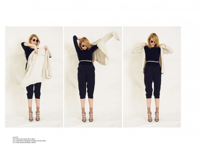
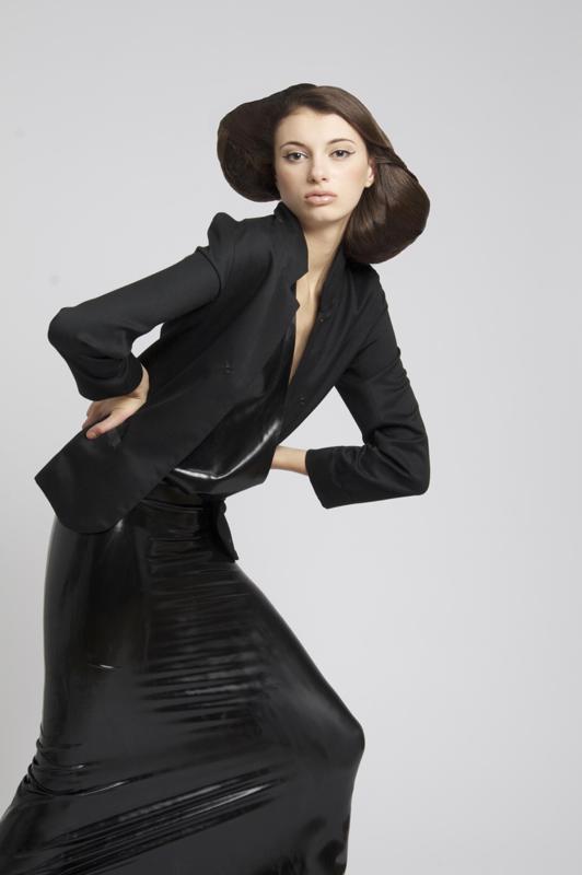
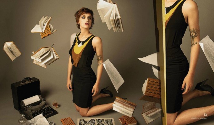
Great example of channeling the collection’s concept into a lookbook that can also serve as a linesheet – each item is clearly presented, yet the buyer is sold on the whole look, that works together. This image doesn’t do anything to sell the clothes in our opinion. Clearly a lookbook image, although we are a little conflicted as to who this woman is that the brand tries to appeal to, it is definitely an image to use for a more story-telling material – lookbook.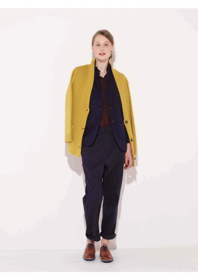 Now this one is interesting – what do you think – linesheet or lookbook? Leave us a comment below.
Sometimes, designers confuse lookbook and linesheet images. They might try to express the idea or concept of the collection through their linesheet. The lookbook is the right place for this. So, creative or stylistic positions by the model should be avoided. Black and white images, or technical drawings can be used. However, in general, these are not really advised, especially for a new line, not well known to buyers. Keep in mind: you want to use every opportunity to remind the buyer how great your pieces are. Black and white photos or technical drawings can miss that chance for you.
Once the brand is better known to the buyers, and your sales are up enough that you can spend money on production of full-color expensive lookbooks for every perspective customer, your linesheets can be presented as technical drawings.


About The Author: BridgeShowroom
Since 2011, BRIDGE SHOWROOM has been representing Europe's finest designers in America.
We are partners, linking together retailers and designers.
More posts by BridgeShowroom